


Technical SEO
I have been doing Technical SEO since last 15 years and I had worked with guruji.com search engine in past as application engineer. In this article, I’ll cover how to build a Carousel slider that doesn’t much affect your webpage LCP, FID and CLS score. Katie Hempenius, from Google has written the best practices on this.
Check out this Demo Slider
Usually when we use third-party sliders like BxSlider, BootStrap Slider or FlexSlider big Cumulative Layout Shift occurs while loading the page. That decrease your web pagespeed score significantly.
Best Practices
Here are some suggestions from official google handlers to optimize Carousel for CLS.
- Use aspect-ratio in CSS so that image CLS doesn’t occur.
- Avoid updating left, top, width, and marginTop element’s properties in sliders.
- Load carousel content using plain HTML.
- Avoid autoplaying of Slider.
- Use scroll-snap CSS property to implement slider.
- Use srcsets for layout specific images.
- Specify images dimension explicitly with height and width attributes.
Let’s Start Building Slider for Web Vitals
First, we will create a basic markup for Carousel.
<div class="carousel">
<div class="slides">
<div class="slide"><img src="https://picsum.photos/id/237/600/300" width="600" height="300" /></div>
<div class="slide"><img src="https://picsum.photos/id/238/600/300" width="600" height="300" /></div>
<div class="slide"><img src="https://picsum.photos/id/239/600/300" width="600" height="300" /></div>
</div>
</div>
Add some CSS for it.
  .carousel {
    width: 100%;
    height: auto;
    position: relative;
    overflow: hidden;
  }
  .slides {
    display: flex;
    width: 100%;
    position: relative;
    transition: all 1s ease-in-out;
  }
  .slide {
    flex-shrink: 0;
    width: 100%;
    height: auto;
  }
Now, as suggested by Google, Add aspect-ratio to all images.
.slide img{
  height:auto;
  width:100%;
  aspect-ratio:2/1;
}
Then lets add arrows for navigation
<a href="#" id="back"><svg stroke="white" fill="white" width="40" height="40" xmlns="http://www.w3.org/2000/svg" fill-rule="evenodd" clip-rule="evenodd"><path d="M12 0c6.623 0 12 5.377 12 12s-5.377 12-12 12-12-5.377-12-12 5.377-12 12-12zm0 1c6.071 0 11 4.929 11 11s-4.929 11-11 11-11-4.929-11-11 4.929-11 11-11zm3 5.753l-6.44 5.247 6.44 5.263-.678.737-7.322-6 7.335-6 .665.753z"/></svg></a>
     <a href="#" id="forward"><svg troke="white" fill="white" width="40" height="40" xmlns="http://www.w3.org/2000/svg" fill-rule="evenodd" clip-rule="evenodd"><path d="M12 0c6.623 0 12 5.377 12 12s-5.377 12-12 12-12-5.377-12-12 5.377-12 12-12zm0 1c6.071 0 11 4.929 11 11s-4.929 11-11 11-11-4.929-11-11 4.929-11 11-11zm-3 5.753l6.44 5.247-6.44 5.263.678.737 7.322-6-7.335-6-.665.753z"/></svg></a>
CSS for navigation
.carousel #back{
          position: absolute;
          margin-left: auto;
          margin-right: auto;
          left: 0;
          top: 50%;
          transform: translate(50%,-50%);
          text-align: center;
          z-index:100;
 }

.carousel #forward{
          position: absolute;
          margin-left: auto;
          margin-right: auto;
          right: 0;
          top: 50%;
          transform: translate(-50%,-50%);
          text-align: center;
          z-index:100;
      }
Preview
Now Lets add optimised images with 60×60 size for initial page load and then load images accordingly using srcset for different screen sizes.
<div class="slides">
        <div class="slide"><img src="https://picsum.photos/id/237/60/30" srcset="https://picsum.photos/id/237/1536/768 1536w" width="67" height="67" sizes="(min-width: 1536px) 1536px, (min-width: 1024px) 1280px, (min-width: 640px) 768px, 320px"  height="30" width="60" /></div>
        <div class="slide"><img src="https://picsum.photos/id/238/60/30" srcset="https://picsum.photos/id/238/1536/768 1536w" width="67" height="67" sizes="(min-width: 1536px) 1536px, (min-width: 1024px) 1280px, (min-width: 640px) 768px, 320px" height="30" width="60" /></div>
        <div class="slide"><img src="https://picsum.photos/id/239/60/30" srcset="https://picsum.photos/id/239/1536/768 1536w" width="67" height="67" sizes="(min-width: 1536px) 1536px, (min-width: 1024px) 1280px, (min-width: 640px) 768px, 320px"  height="30" width="60" /></div>
      </div>
Finally Add JavaScript to make our slider working
(() => {
  const slidesEl = document.querySelector(".slides");

  const backButtonEl = document.querySelector("#back");
  const forwardButtonEl = document.querySelector("#forward");

  backButtonEl.addEventListener("click", () => navigate("backward"));
  forwardButtonEl.addEventListener("click", () => navigate("forward"));

  const slideWidth = slidesEl.offsetWidth;
  //console.log(slideWidth);
  const overallWidth = slidesEl.scrollWidth; // = slideWidth * numSlides
  //console.log(overallWidth);


  function navigate(direction) {
    const x = calculateNewPosition(direction);
    slidesEl.style.transform = `translateX(${x}px)`;
  }

  function calculateNewPosition(direction) {
    const str = slidesEl.style.transform;
    console.log(str);
    const x = str ? parseInt(str.match(/-?(\d+)/g)) : 0;
        console.log(x);
    if (direction === "forward") {
      const atLastSlide = x === -overallWidth + slideWidth;
      // Non-looping carousel: Stops at last slide
      return atLastSlide ? x : x - slideWidth;
      // Looping carousel: Transitions from last slide to first slide
      // return atLastSlide ? 0 : x-slideWidth;
    } else if (direction === "backward") {
      const atFirstSlide = x === 0;
      // Non-looping carousel: Stops at first slide
      return atFirstSlide ? x : x + slideWidth;
      // Looping carousel: Transitions from first slide to last slide
      // return atFirstSlide ? -overallWidth + slideWidth : x + slideWidth;
    }

  }

})();
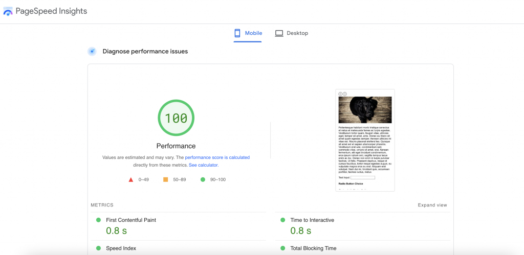
Final Result
Full Stack Software Engineer | AI Author – Credentials
Experience: 20+ Years in Software Development
Credentials: B.E. Computer, SVNIT Surat (2004)